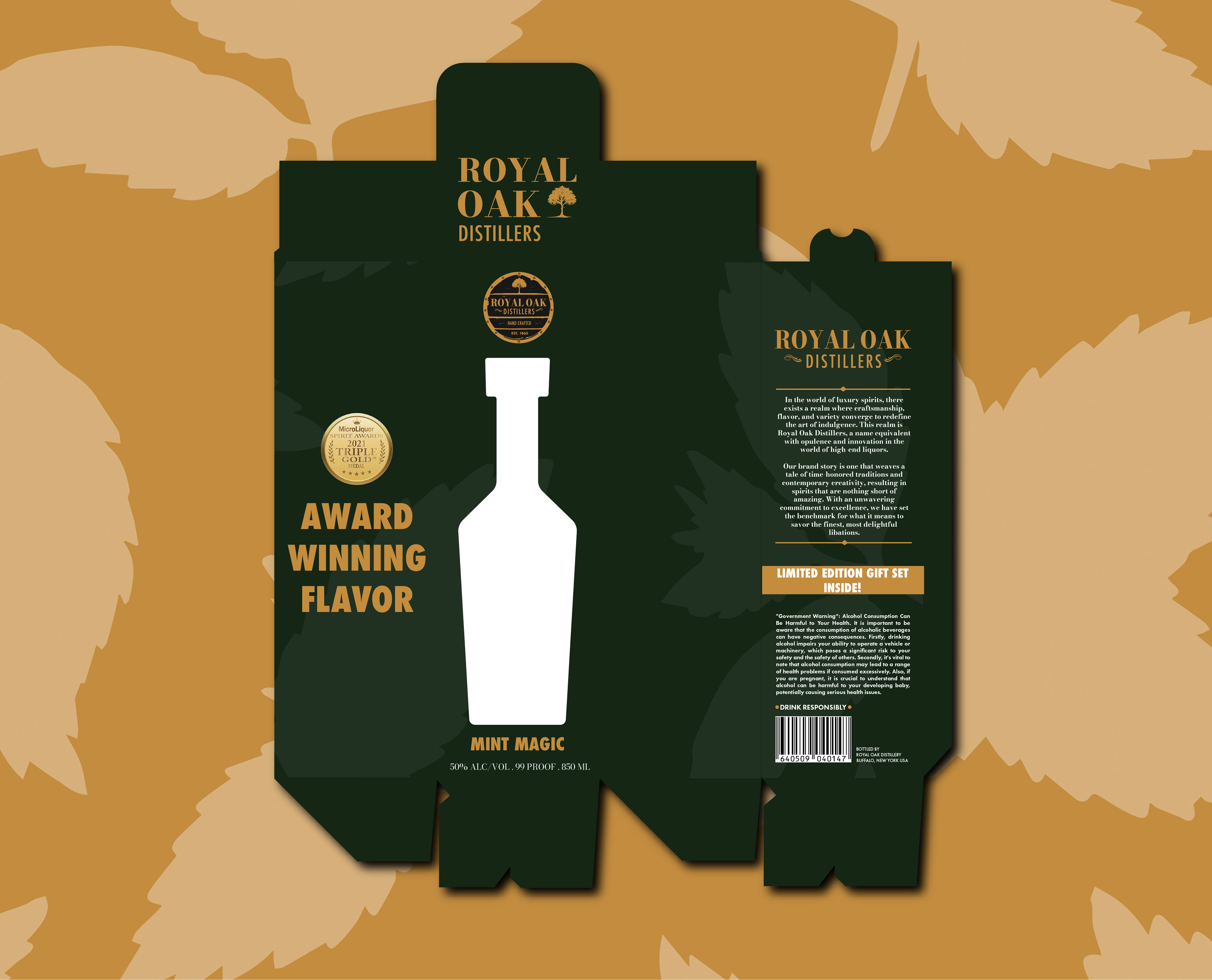
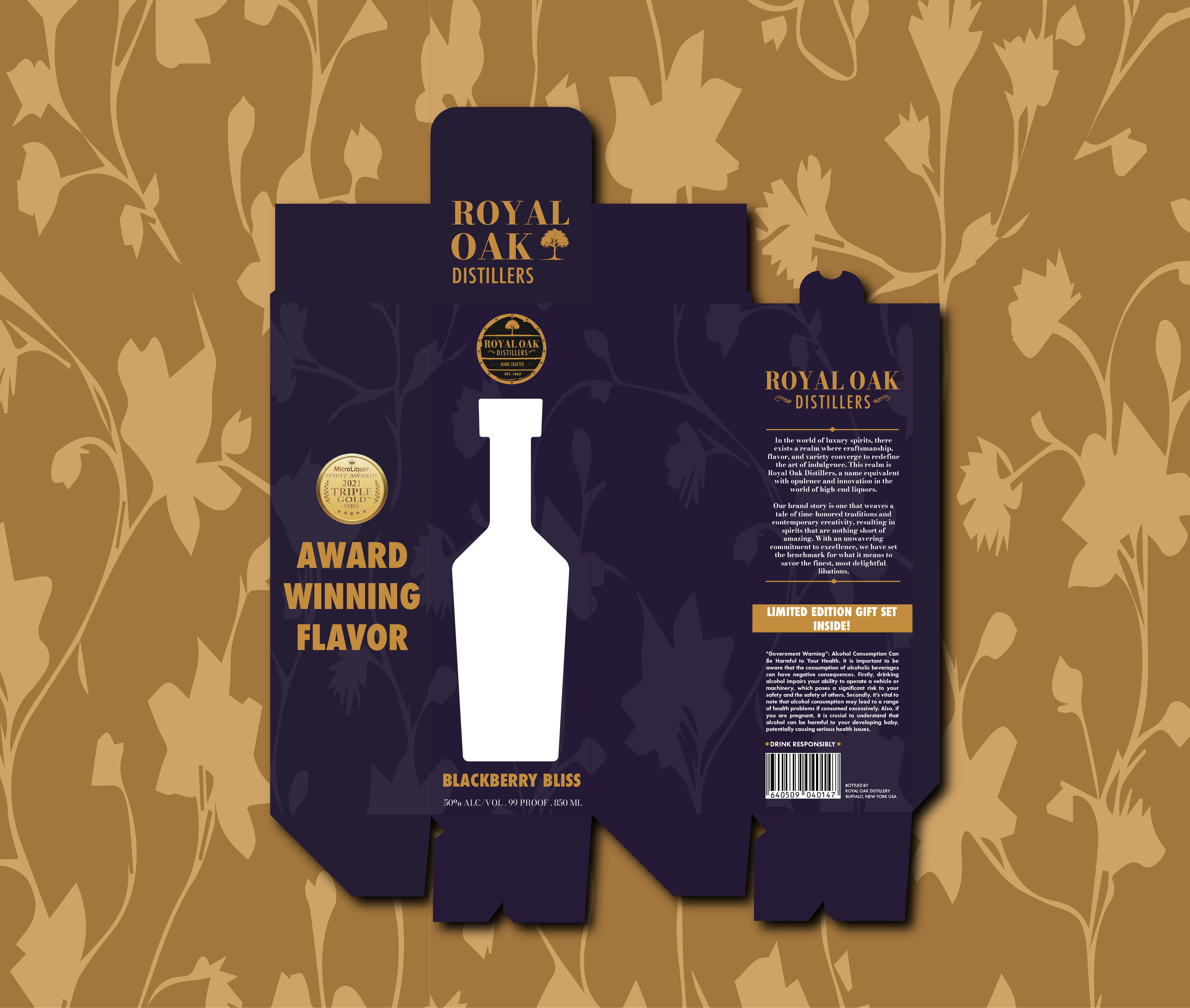
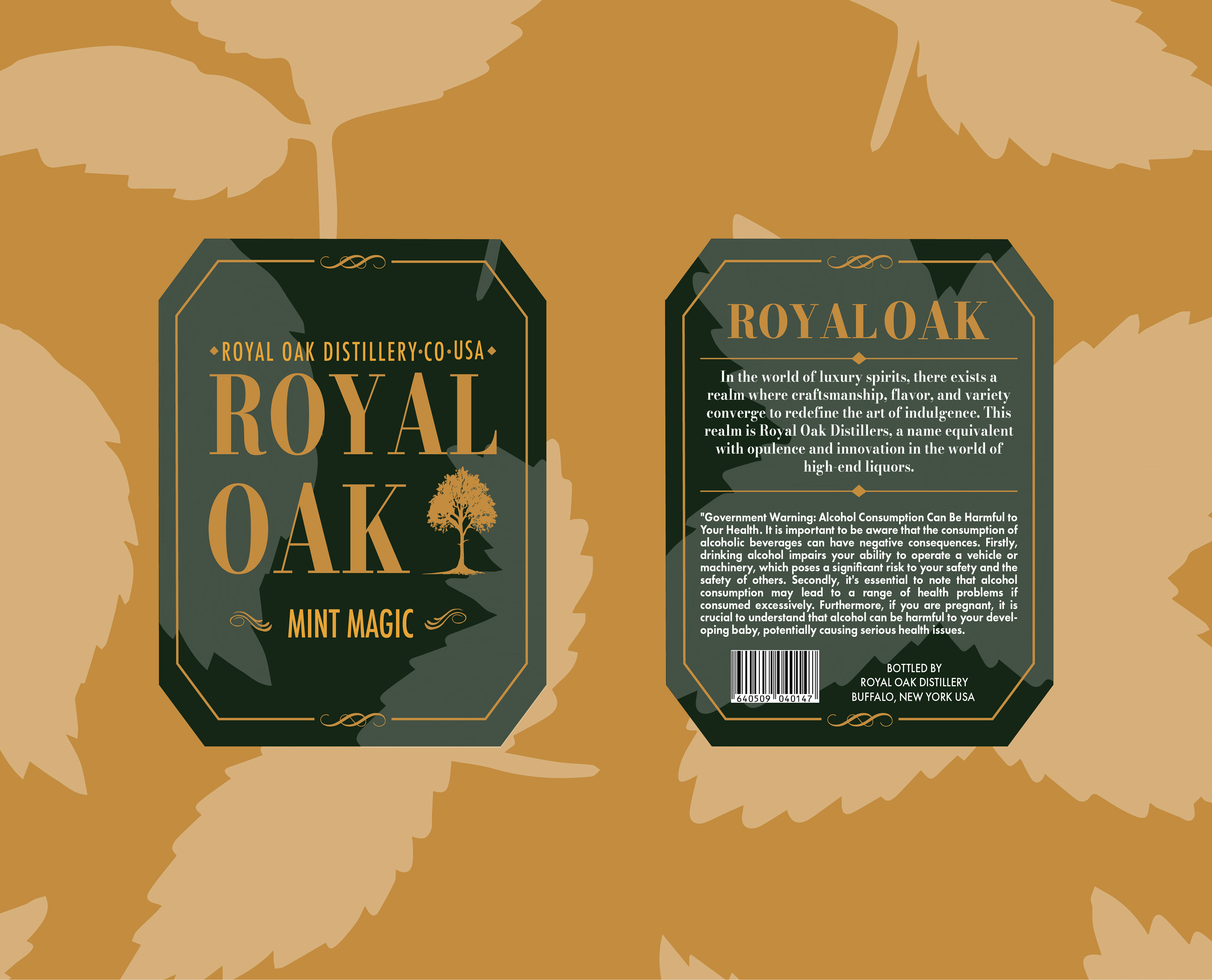
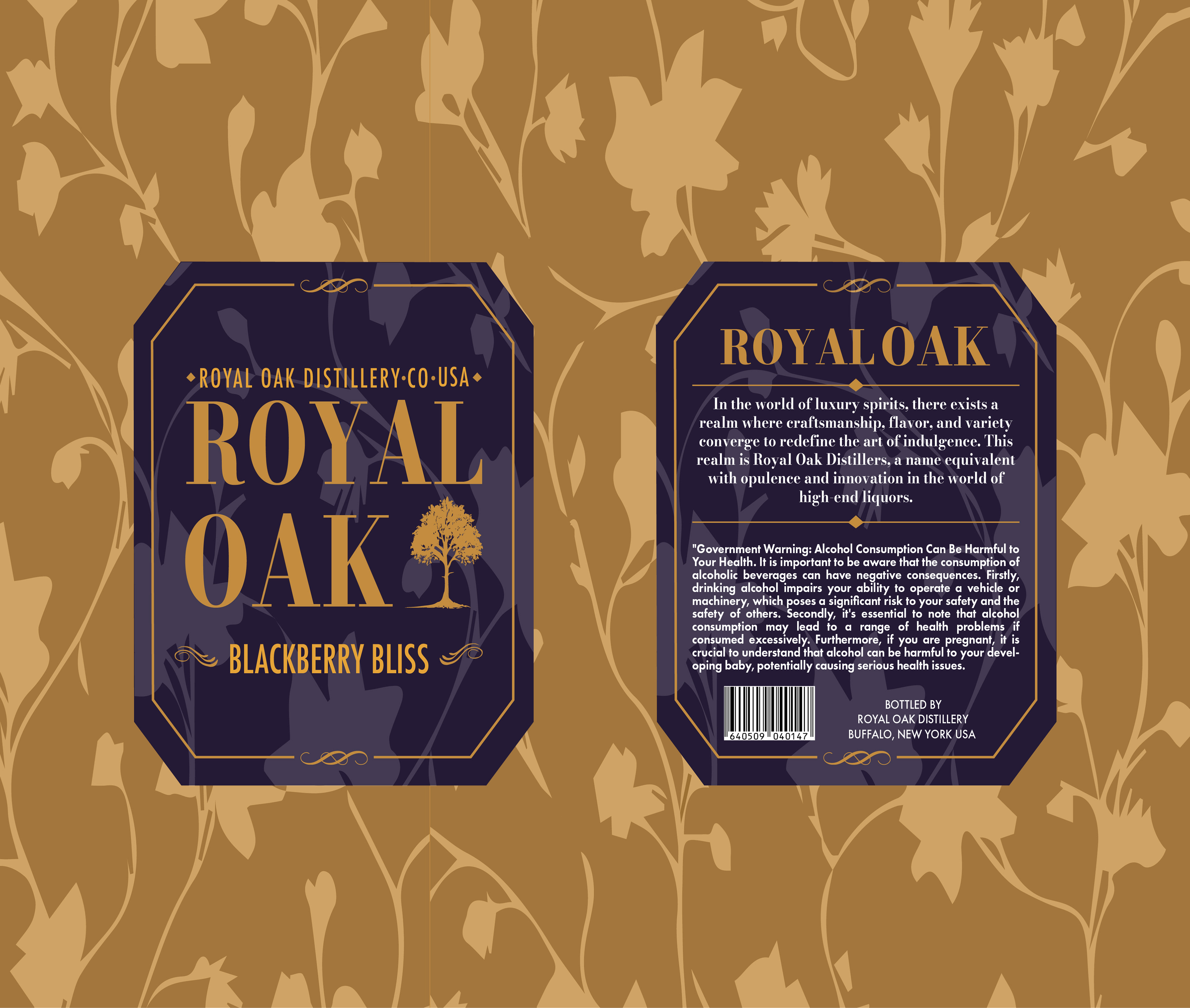
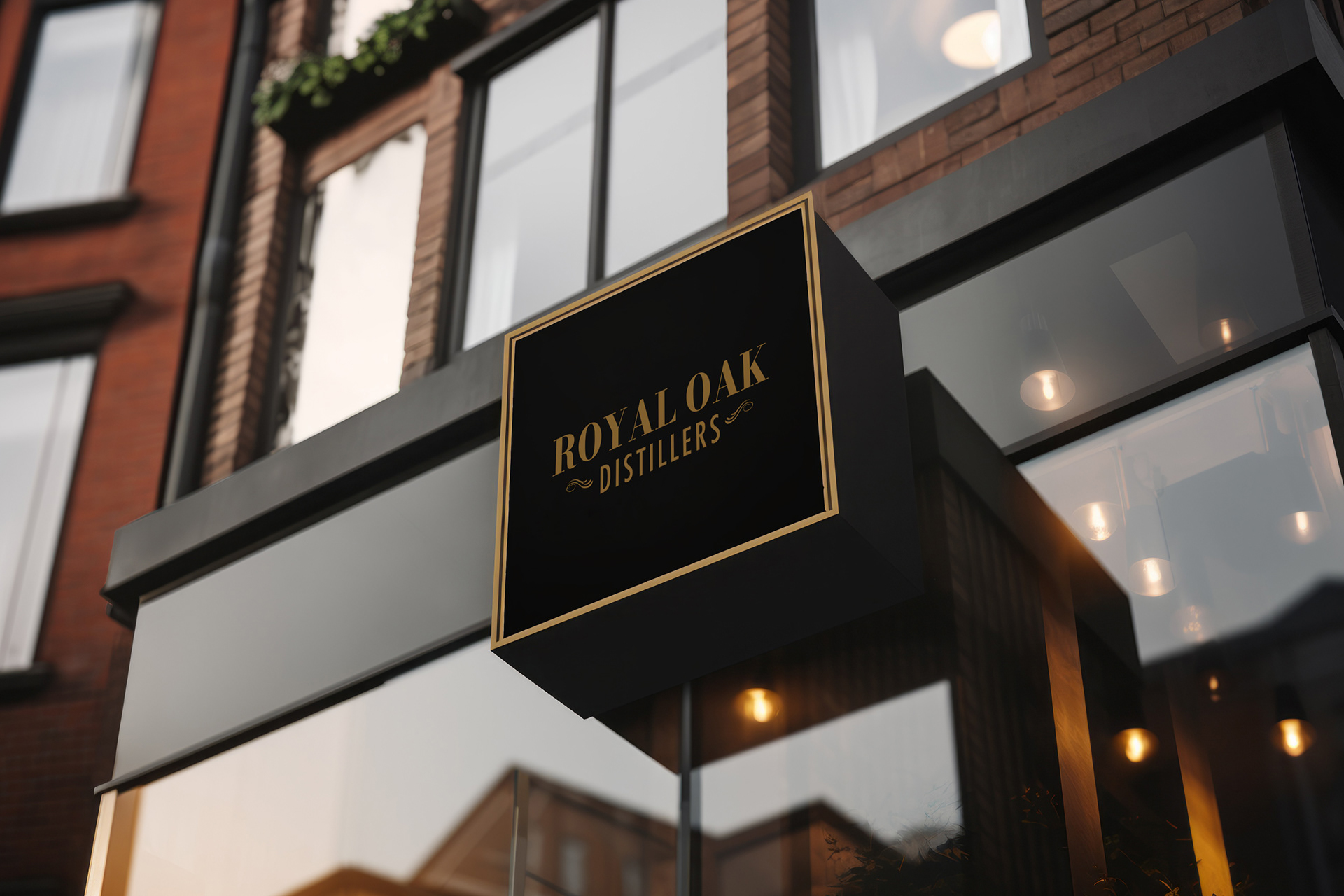
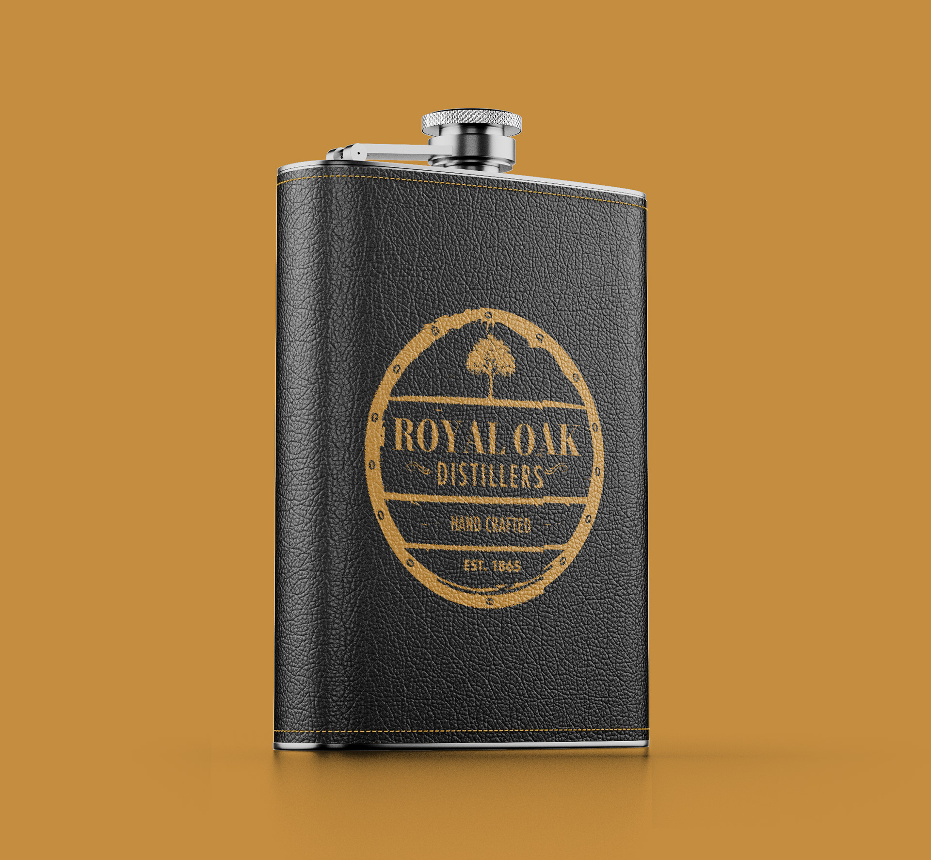
Category
Brand Identity
Logo Design
Package Design
Project Summary
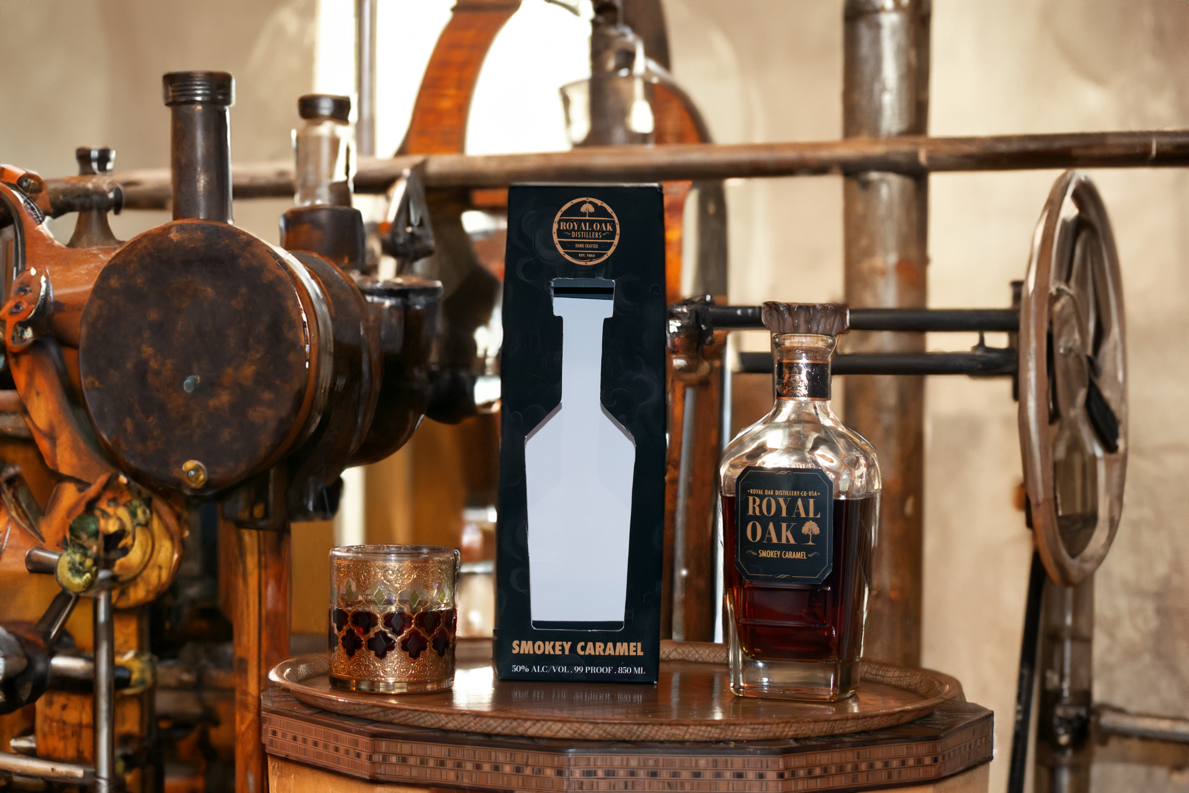
Royal Oak is a high-end liquor brand that prioritizes the art of crafting elegance. 
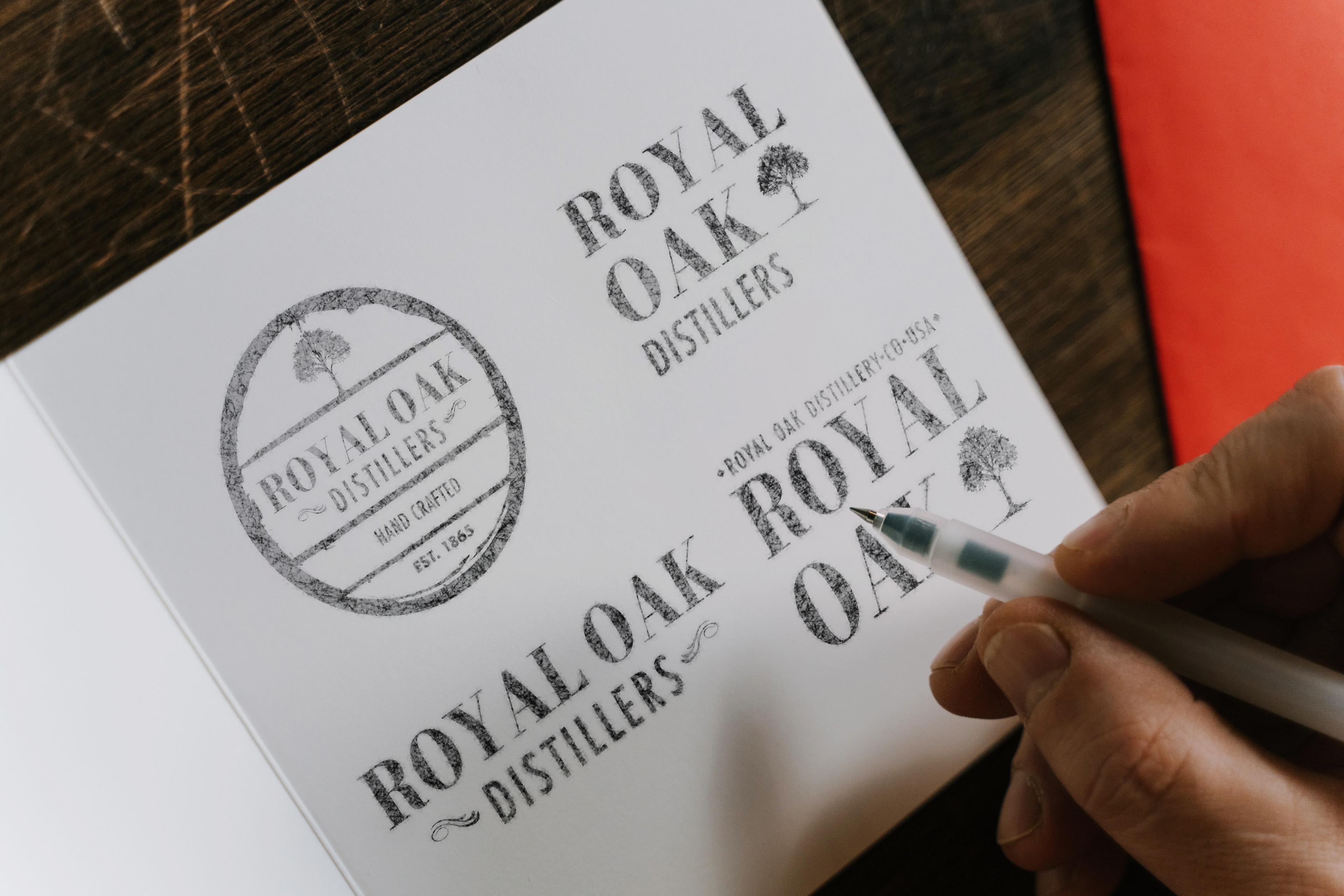
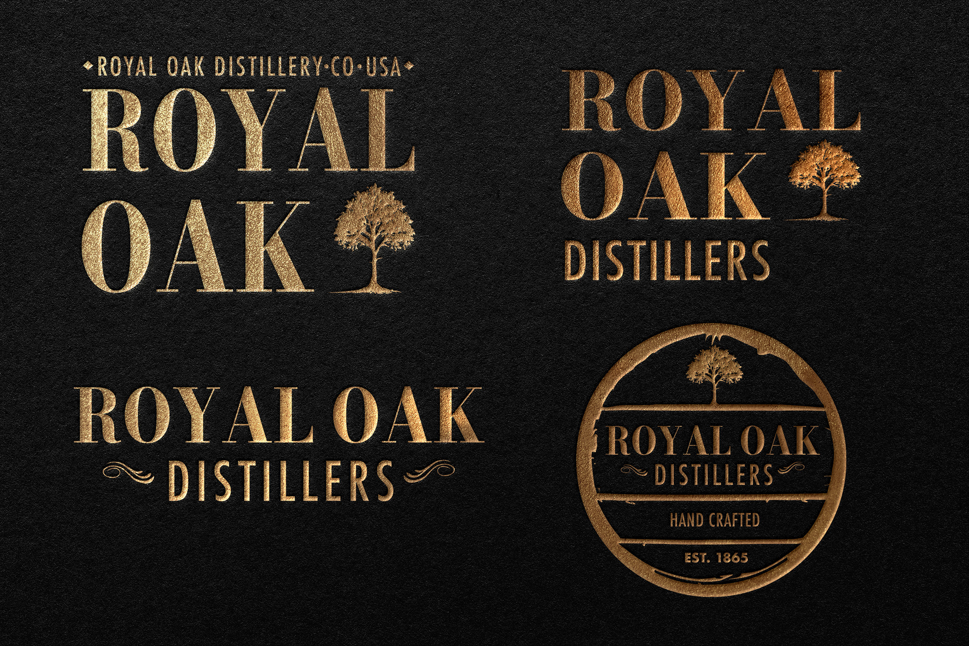
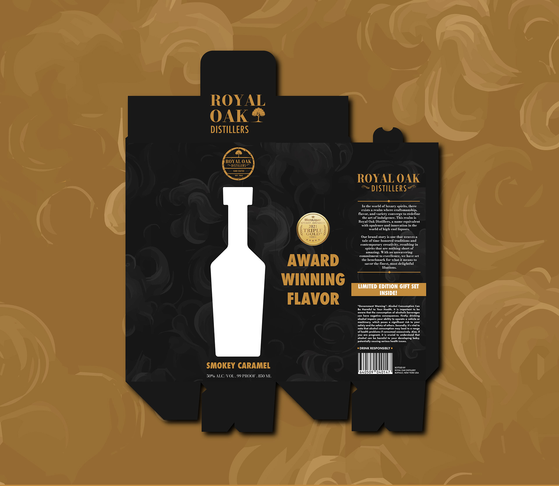
The project deliverables encompassed a series of cohesive window package designs. A window package design, in this context, serves as a packaging solution that elegantly showcases the product within. The designs themselves center around the unique flavors offered within the Royal Oak liquor brand, such as Smokey Caramel, Blackberry Bliss, and Mint Magic.

The Early Challenges
When crafting the logo for Royal Oak, I aimed for simplicity and sophistication. The circular design resembles an oak barrel, while rough details add a touch of age. Using black and gold, I hinted at luxury and high quality, reflecting Royal Oak's prestigious standing in the liquor industry.
The Final Design
The final logo design for Royal Oak perfectly embodies the essence of an oak barrel, as intended. Choosing the Bodoni font added an elegant touch, aligning seamlessly with the brand's sophistication. Additionally, I crafted various logo variations without the badge, strategically placing them across different areas of the package designs within the series, ensuring a cohesive and captivating visual identity.

Three Patterns, Three Flavors
I created three unique patterns for Royal Oak's liquor flavors. Smokey Caramels features smokey clouds on a black background, embodying the rich caramel flavor. Mint Magic showcases dark green with mint leaves, evoking the refreshing minty taste. Lastly, Blackberry Bliss presents deep purple with blackberry vines, symbolizing the juicy, natural blackberry flavor. These patterns enhance the packaging, reflecting the distinct flavors of each liquor option.
Package One Smokey Caramel
Package one features the smokey clouds pattern on a deep black background, maintaining cohesion with the brand's aesthetic. A precisely cut window on the front displays the bottle and label design, ensuring a captivating presentation of the liquor. Throughout each package design, I've kept the logo and information consistent, contributing to the overall coherence of the packaging series.
Label Design Smokey Caramel
The label design for the Smokey Caramel flavor maintains consistency by incorporating the subtle smoke pattern in the background. On the front, an alternate version of the logo accompanies the specific flavor name. Meanwhile, the back of the label features a brief brand story along with mandatory government information, adhering to regulatory requirements for alcoholic products.
Package Two Mint Magic
Package two features mint leaves on a deep green background, maintaining cohesion with the brand's aesthetic. A precisely cut window on the front displays the bottle and label design, ensuring a captivating presentation of the liquor. Throughout each package design, I've kept the logo and information consistent, contributing to the overall coherence of the packaging series.
Package Three BlackBerry Bliss
Package three consists of blackberry vines on a deep purple background, maintaining cohesion with the brand's aesthetic. A precisely cut window on the front displays the bottle and label design, ensuring a captivating presentation of the liquor. Throughout each package design, I've kept the logo and information consistent, contributing to the overall coherence of the packaging series.
Royal Oak Advertisements
The advertisements for Royal Oak elegantly showcase the package designs, featuring photographs taken by myself. These ads focus on the sophisticated experience one would enjoy when purchasing the product from the shelves. Each design is highlighted individually to emphasize its standalone beauty, while also illustrating the seamless harmony when displayed together. 
Back to Top