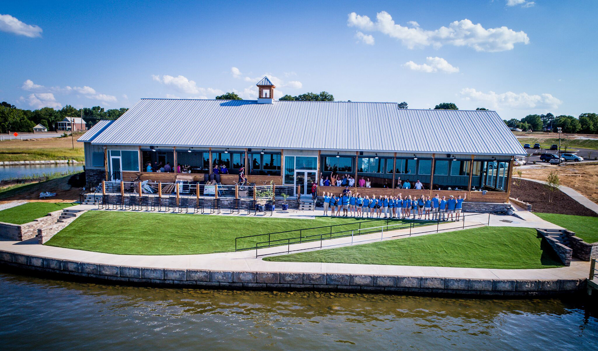
Break On The Lake
Restaurant Menu Design
- Page layout
- Typography
- Branding
- Photography
- Project management
- Attention to detail
- Adhering to brand guidelines
- Illustration
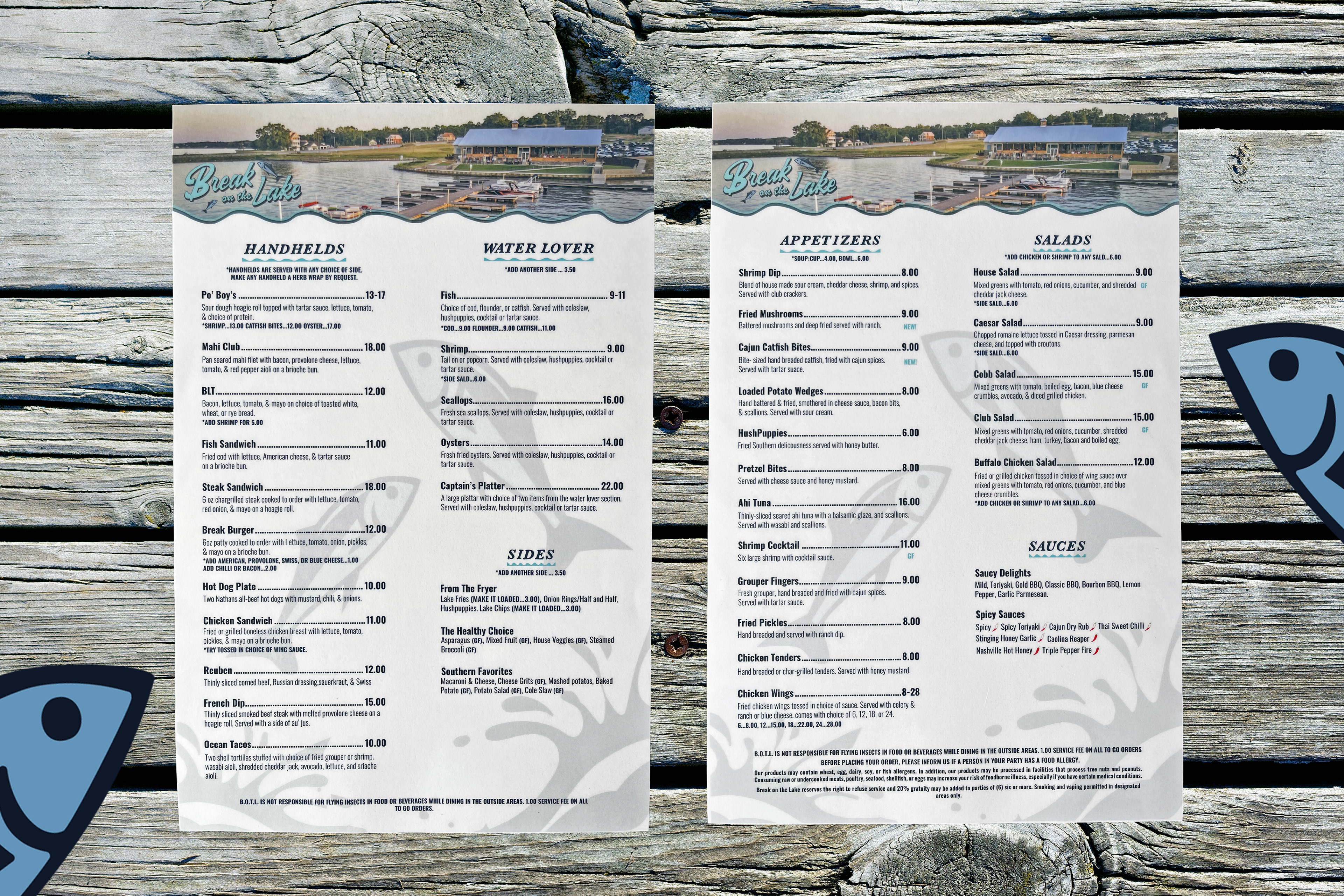
I was entrusted with redesigning all six menus for Break on the Lake, a restaurant situated on the scenic Lake Greenwood, SC. The objective was to create a unified and cohesive design across all menus, despite their varied original formats.
The project involved not only the redesign of the menus but also the development of custom illustrations and compelling copywriting to enhance the overall dining experience. This comprehensive approach ensured that each menu was visually aligned while maintaining the restaurant’s unique character and style.
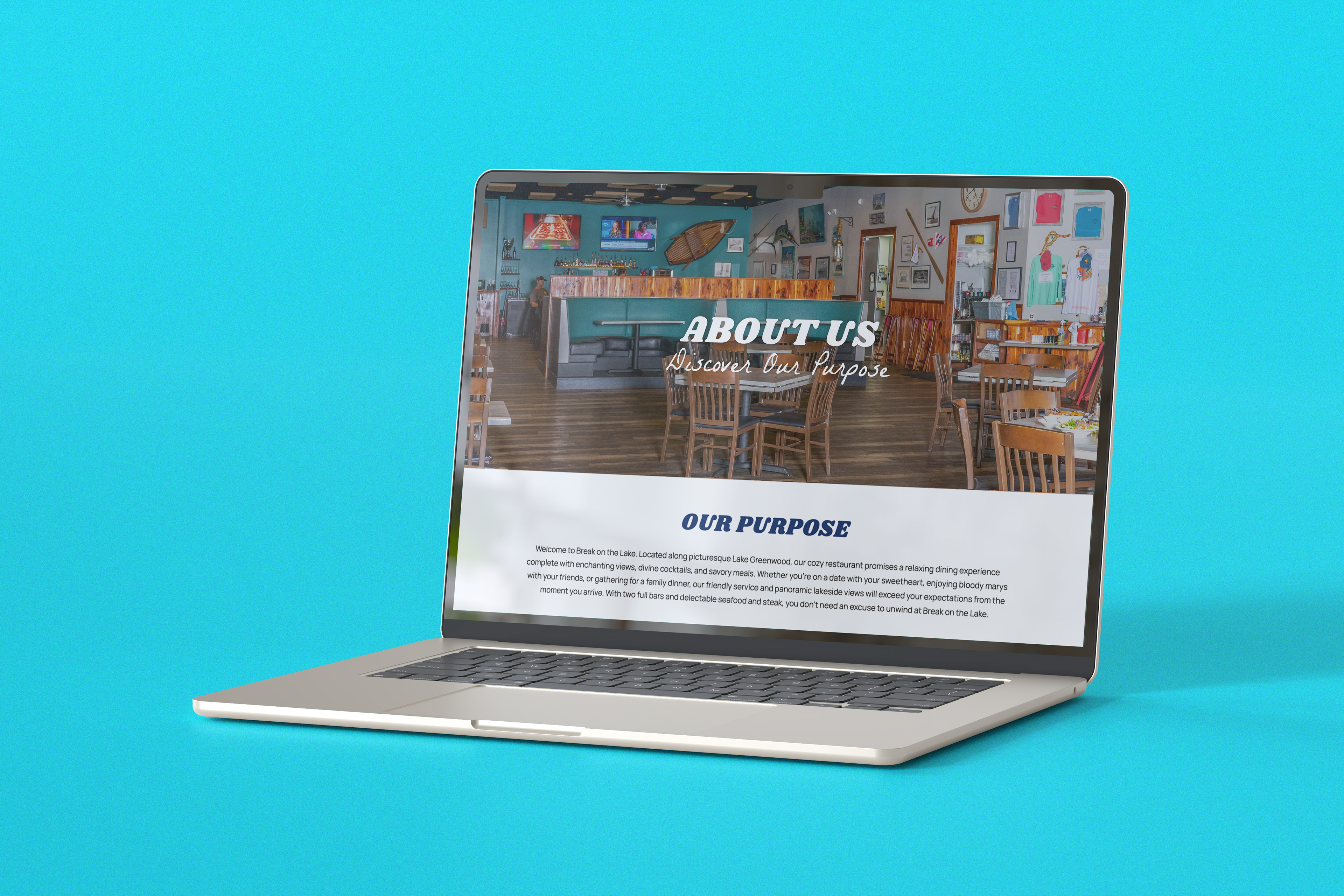
In addition to the menus, I updated the restaurant's website by refining the copy and adding new imagery. These enhancements aimed to increase appeal to the target audience while providing an aesthetic touch that complemented the restaurant’s branding.