Category
Brand Identity
Logo Design
Package Design
Project Summary
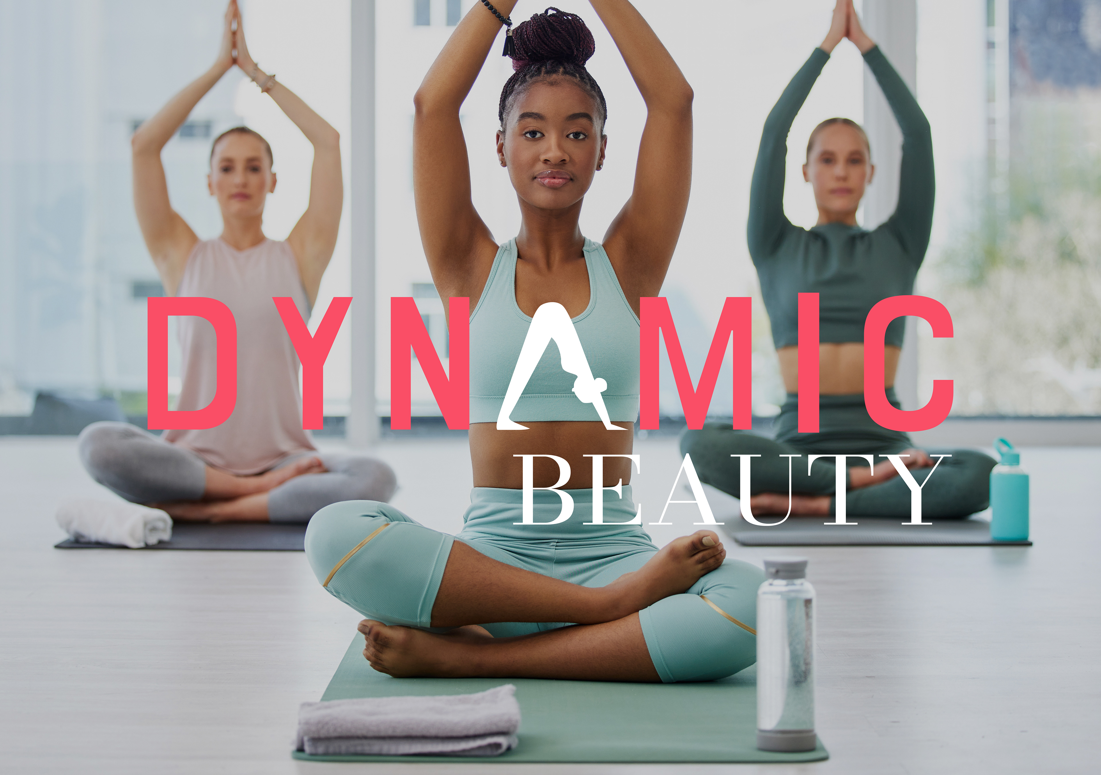
Dynamic Beauty is a cosmetics brand crafted for the active, modern woman—whether at the gym or on the go. This portfolio project consisted of creating the entire brand, including label designs that reflect the brand's essence through vibrant patterns, colors, typography, and logo design.
A Dynamic Start
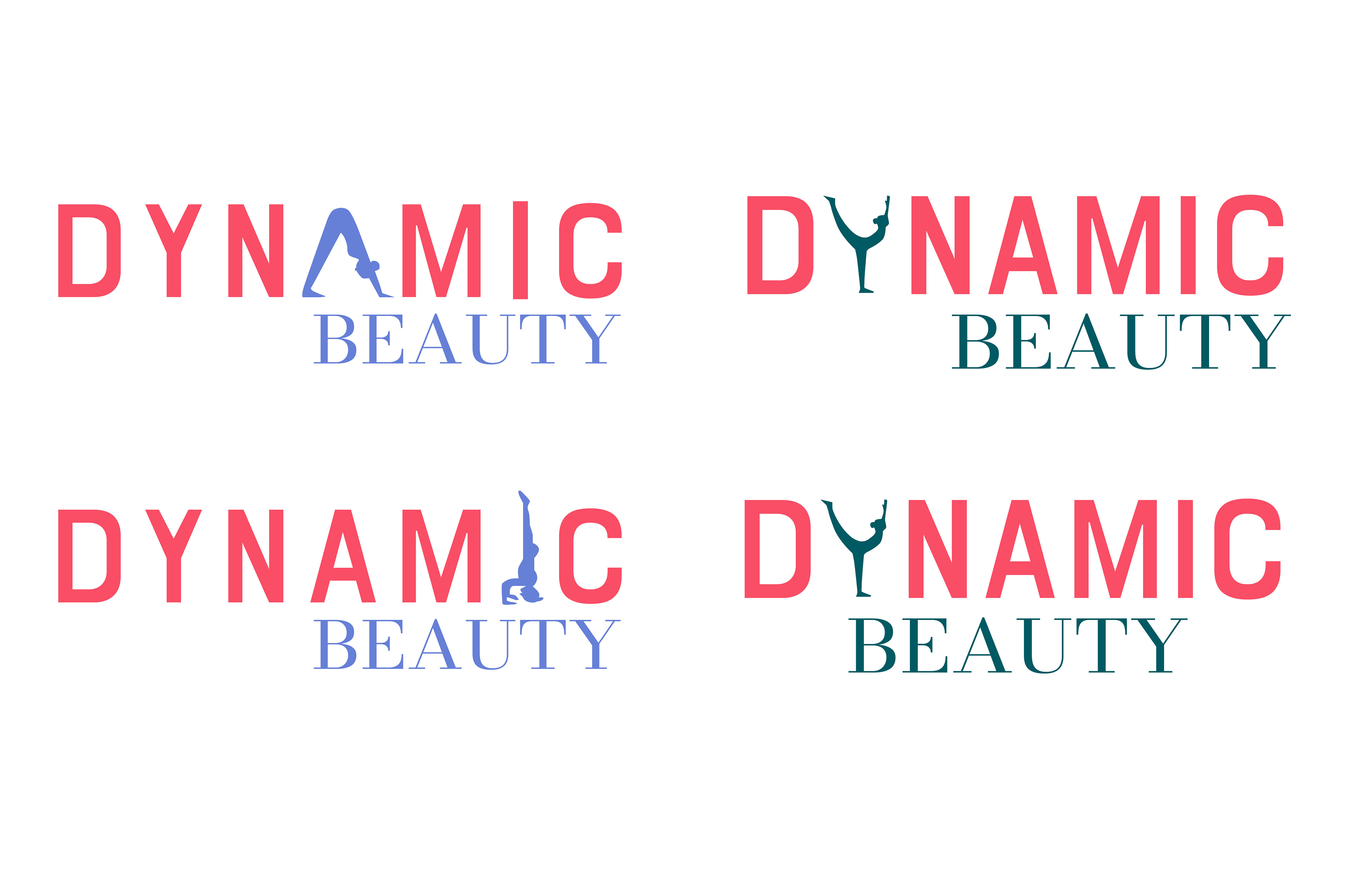
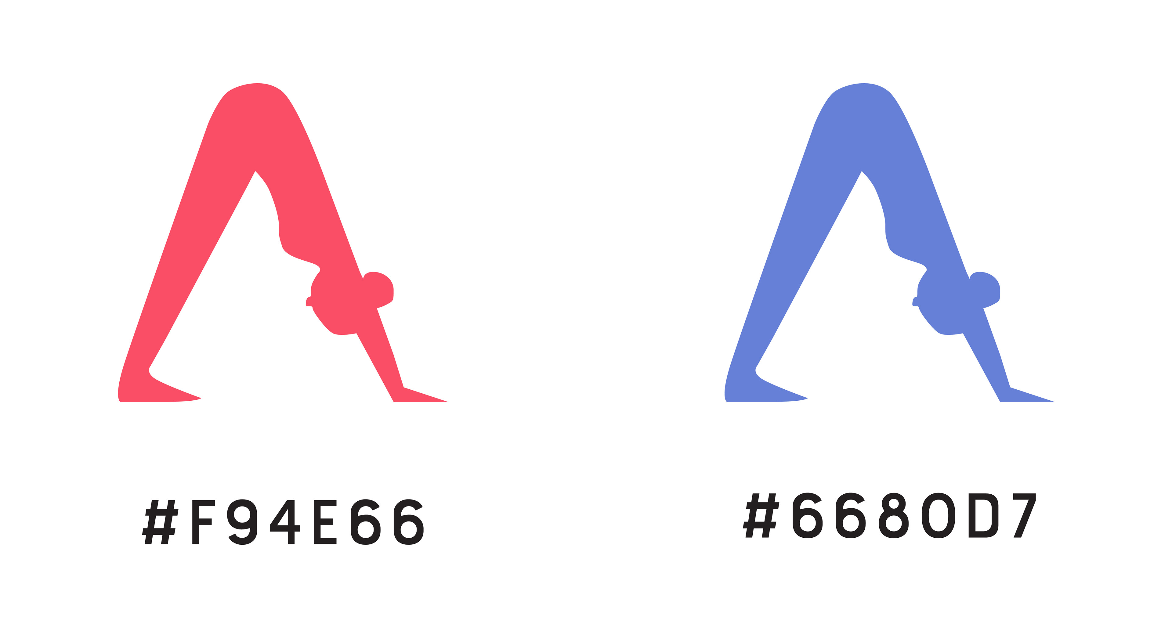
In designing the Dynamic Beauty logo, I aimed to capture the energy of active women, incorporating yoga poses into the letterforms. These subtle nods to movement resonate with my target audience. Furthermore, the pinkish-red and blue color scheme speaks to the brand's active essence and the preferences of the female target audience.
The Final Design
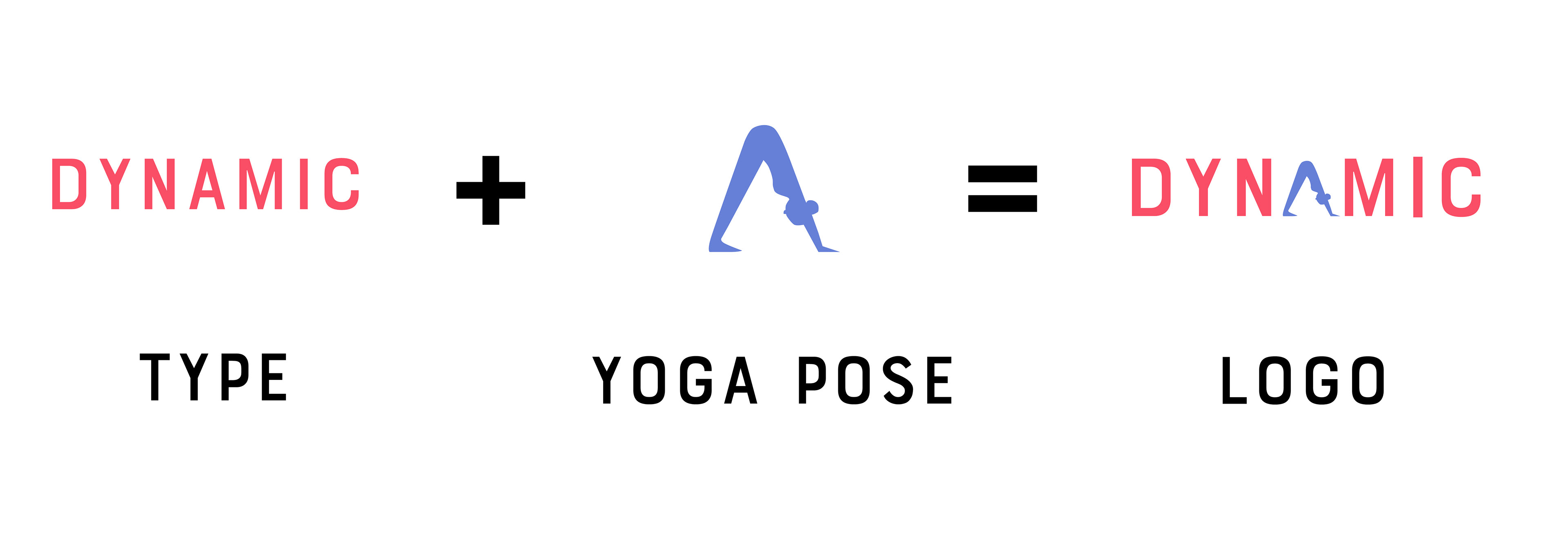
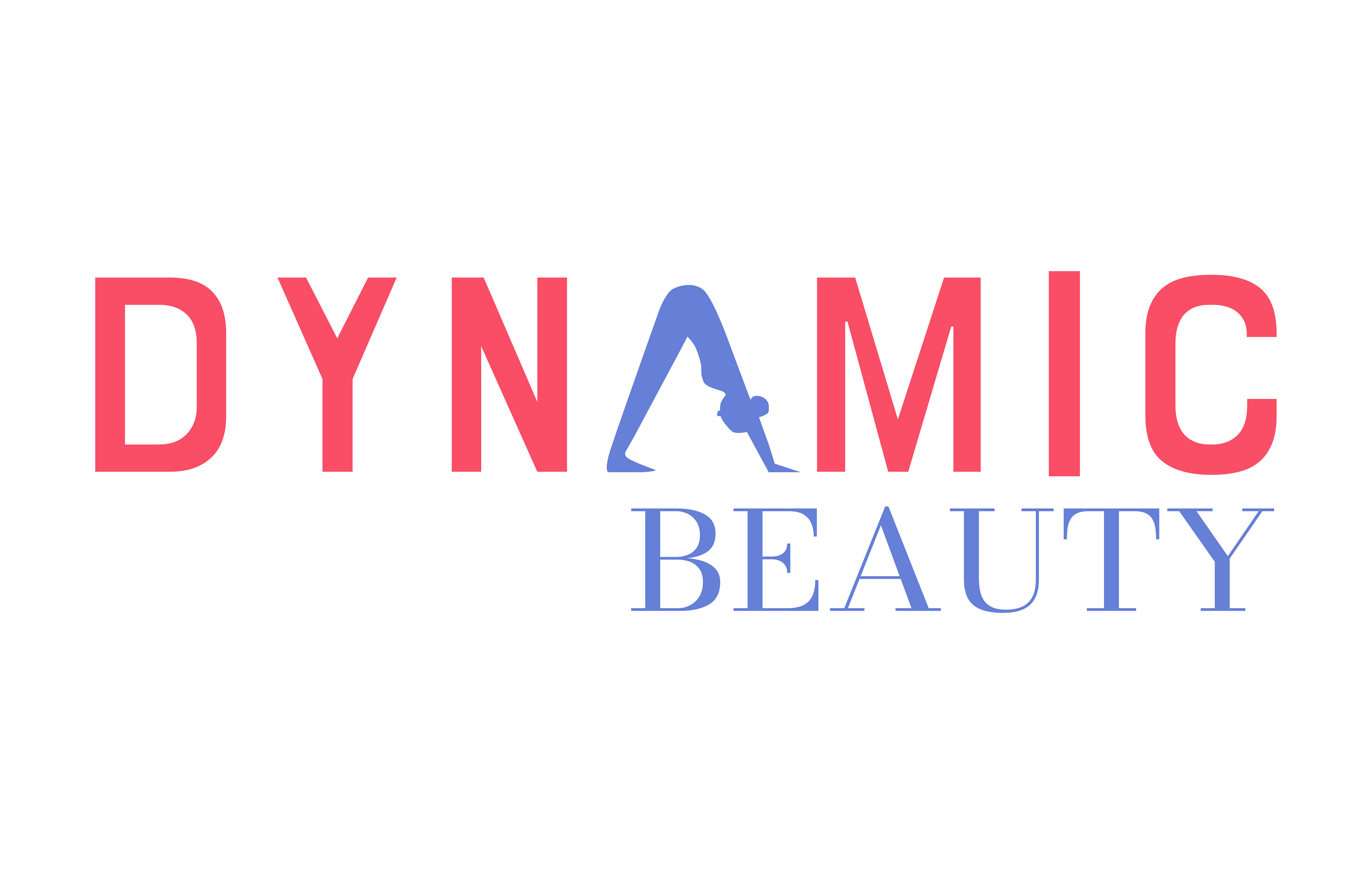
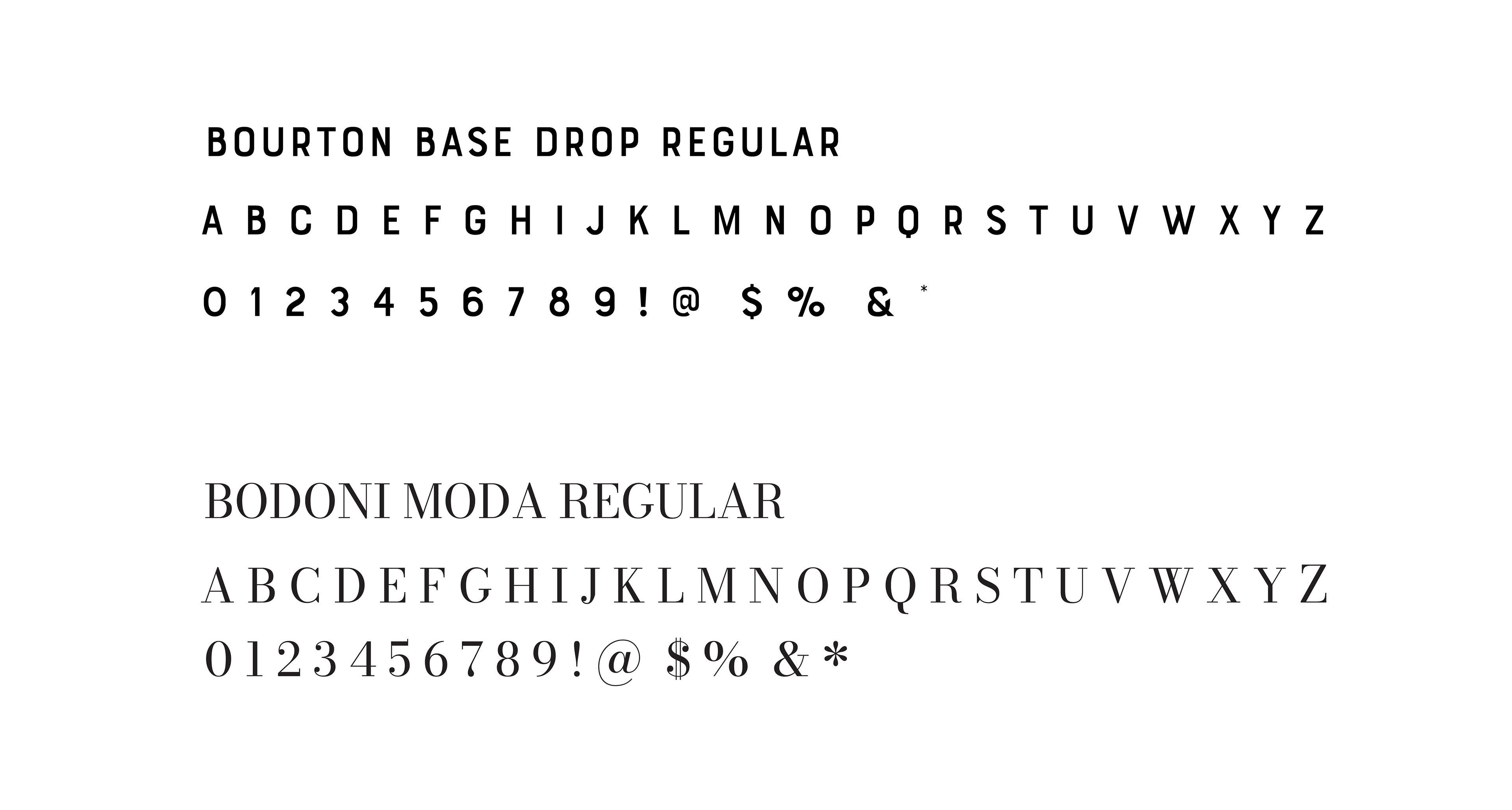
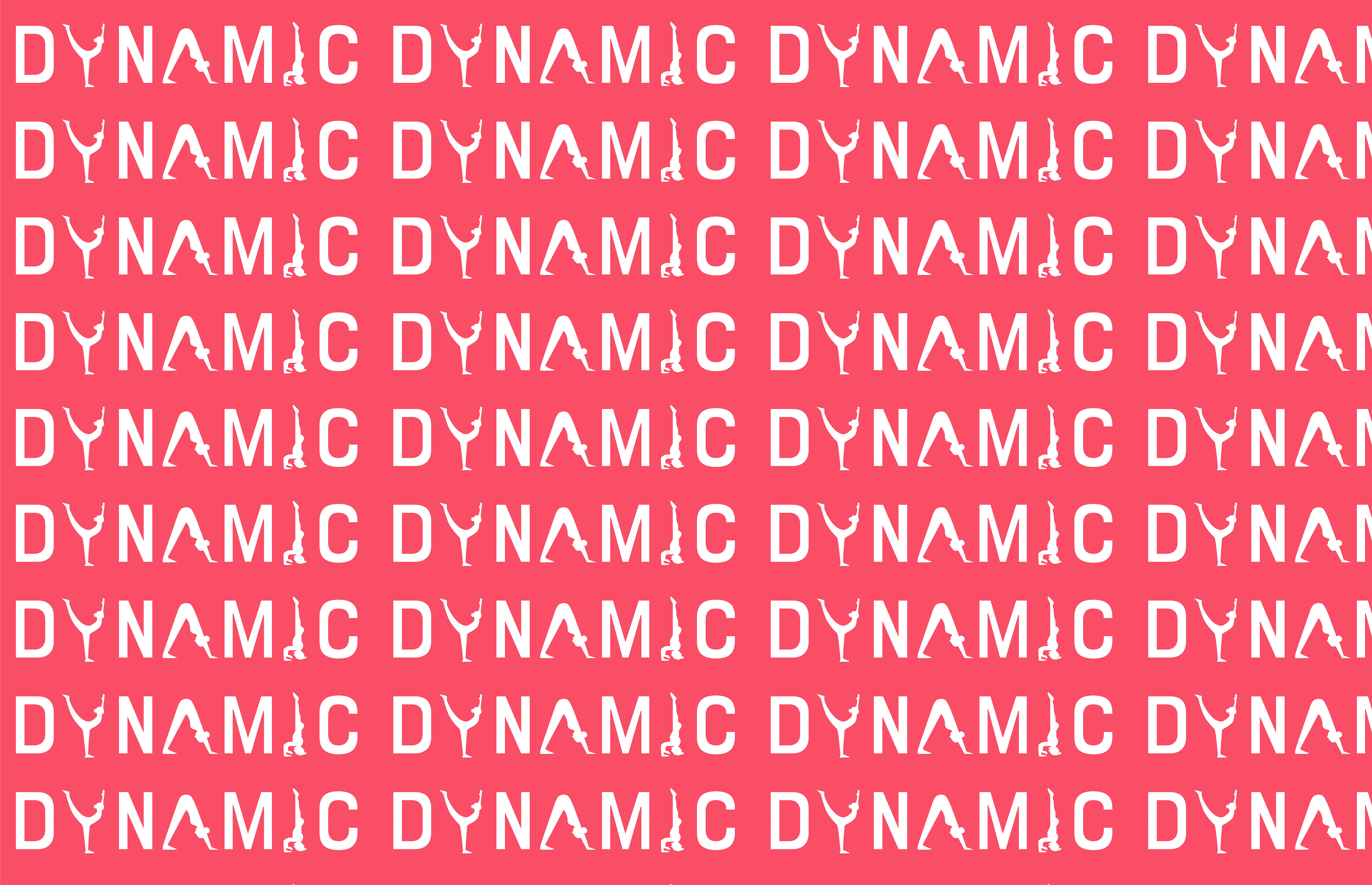
In the final Dynamic Beauty logo, I seamlessly integrated a yoga pose into the 'A' of Dynamic, enhancing depth without sacrificing clarity. I highlighted this feature with the secondary color blue. Exploring various yoga poses, each symbolizing dynamism, I later incorporated them into the brand pattern. For typography, I opted for a bold sans-serif font for its sleek look, balanced by a serif font to provide contrast within the logo.
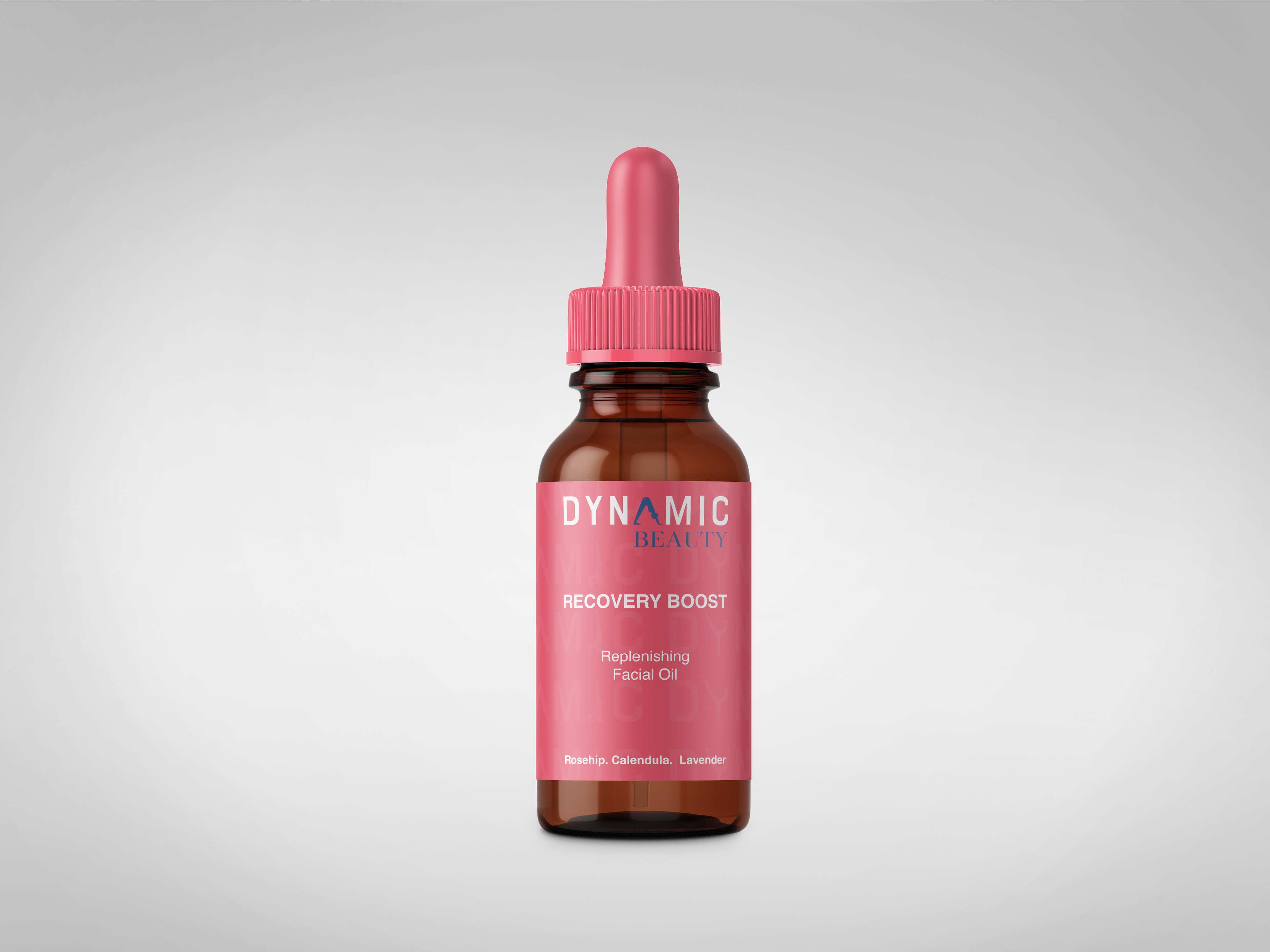
First Label Design
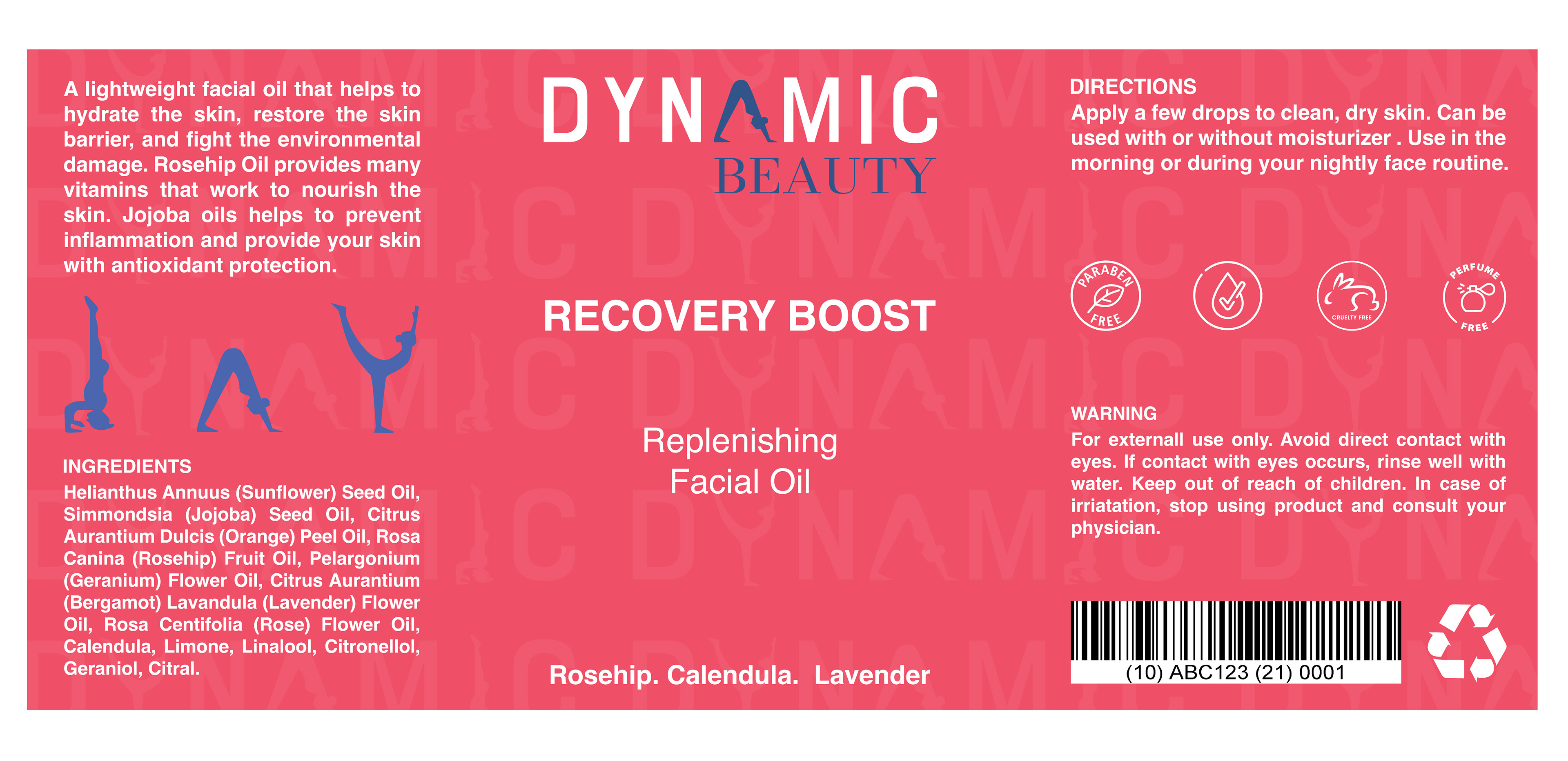
My first label design was for a face oil, which required extra attention to readability due to its smaller size. To ensure clarity, I sized the text appropriately and used a bold weight for increased legibility. Incorporating the yoga figures from the pattern in a dark blue provided contrast against the background. Additionally, I included the product's ingredients on the label to inform consumers about its contents. The face oil was specifically formulated for replenishing the skin after working out or engaging in physical activity, aligning with the active lifestyle of our target audience.
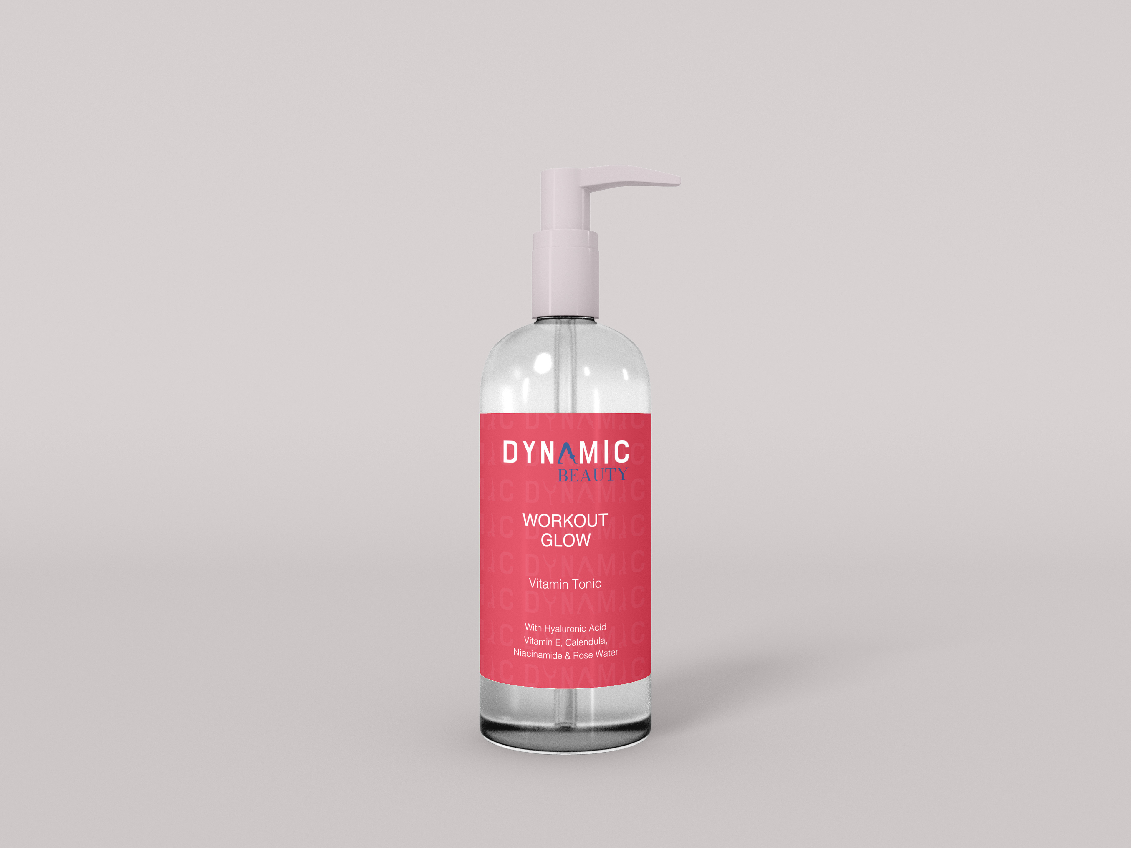
Second Label Design
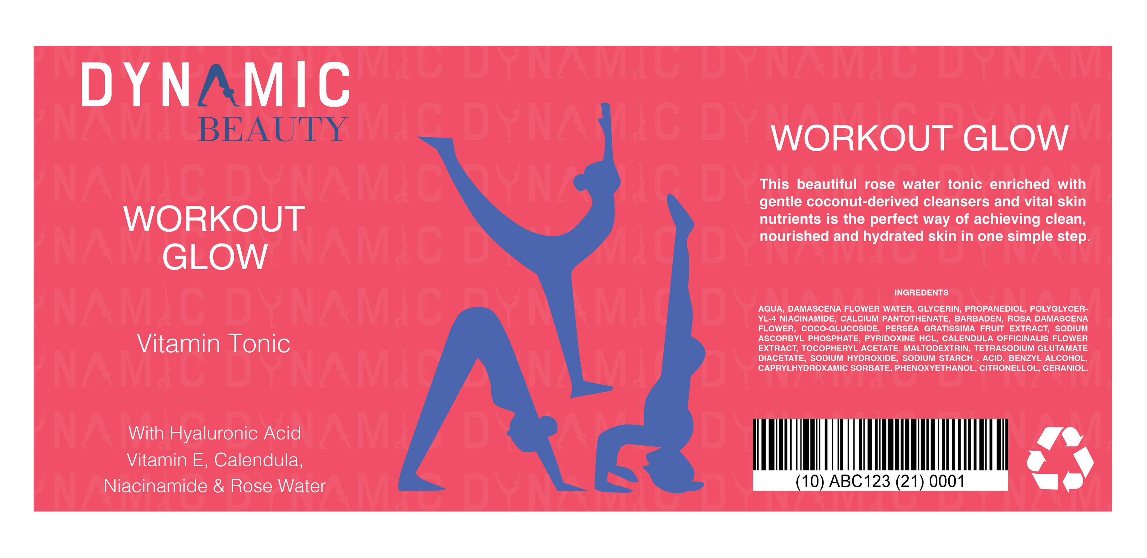
My second label design was for an after-workout spray called Workout Glow, specifically formulated to cleanse dirt, sweat, and makeup after the gym. This design differed slightly from my first, as the layout had to accommodate the larger surface area of the spray bottle compared to the smaller serum bottle. However, I maintained consistency across colors, patterns, logo, and typography.
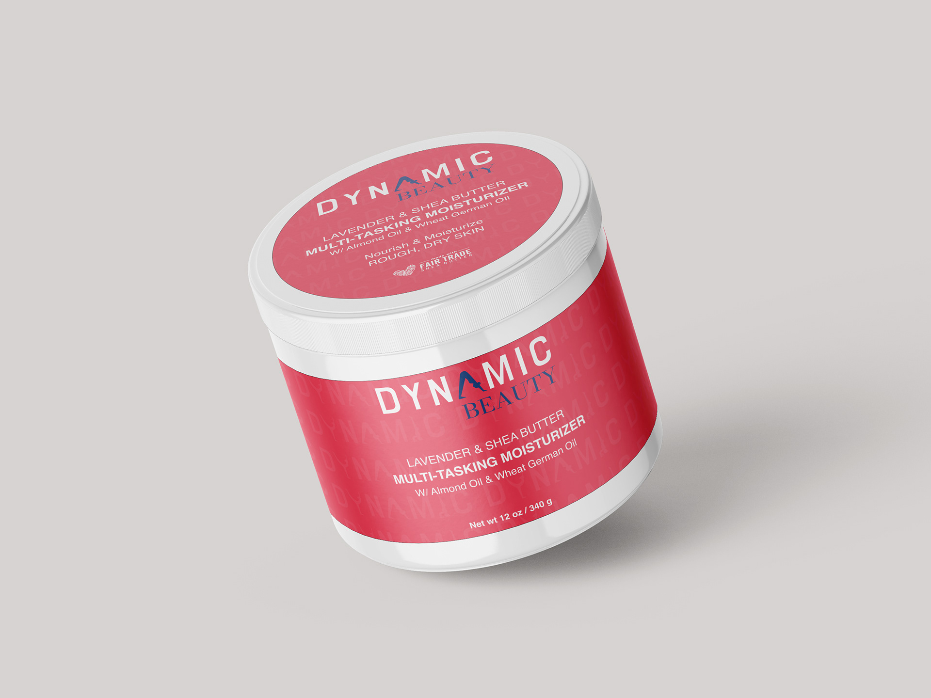
Third Label Design
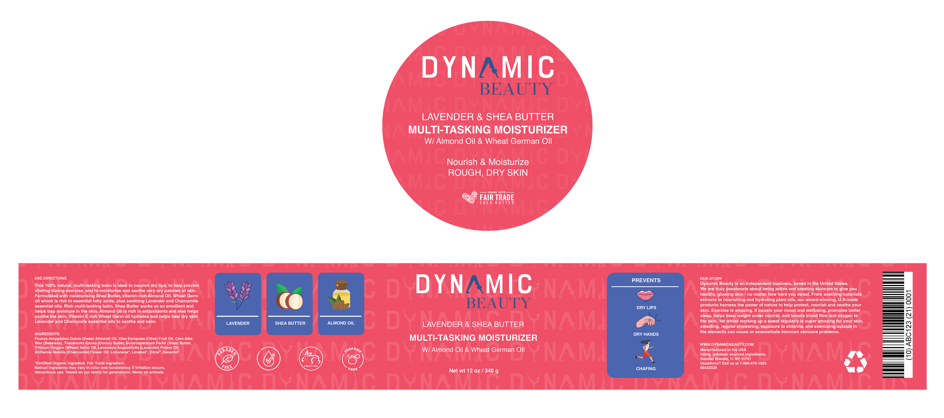
My final label design for a moisturizing cream was complex due to its wrap-around nature. Ensuring readability from all angles required careful layout planning. I included ingredient illustrations and depictions of different use cases to enhance the design. Additionally, I created a separate top lid label for consistency with the logo and product title. This approach aimed to provide consumers with a clear understanding of the product while maintaining a cohesive design across all elements.
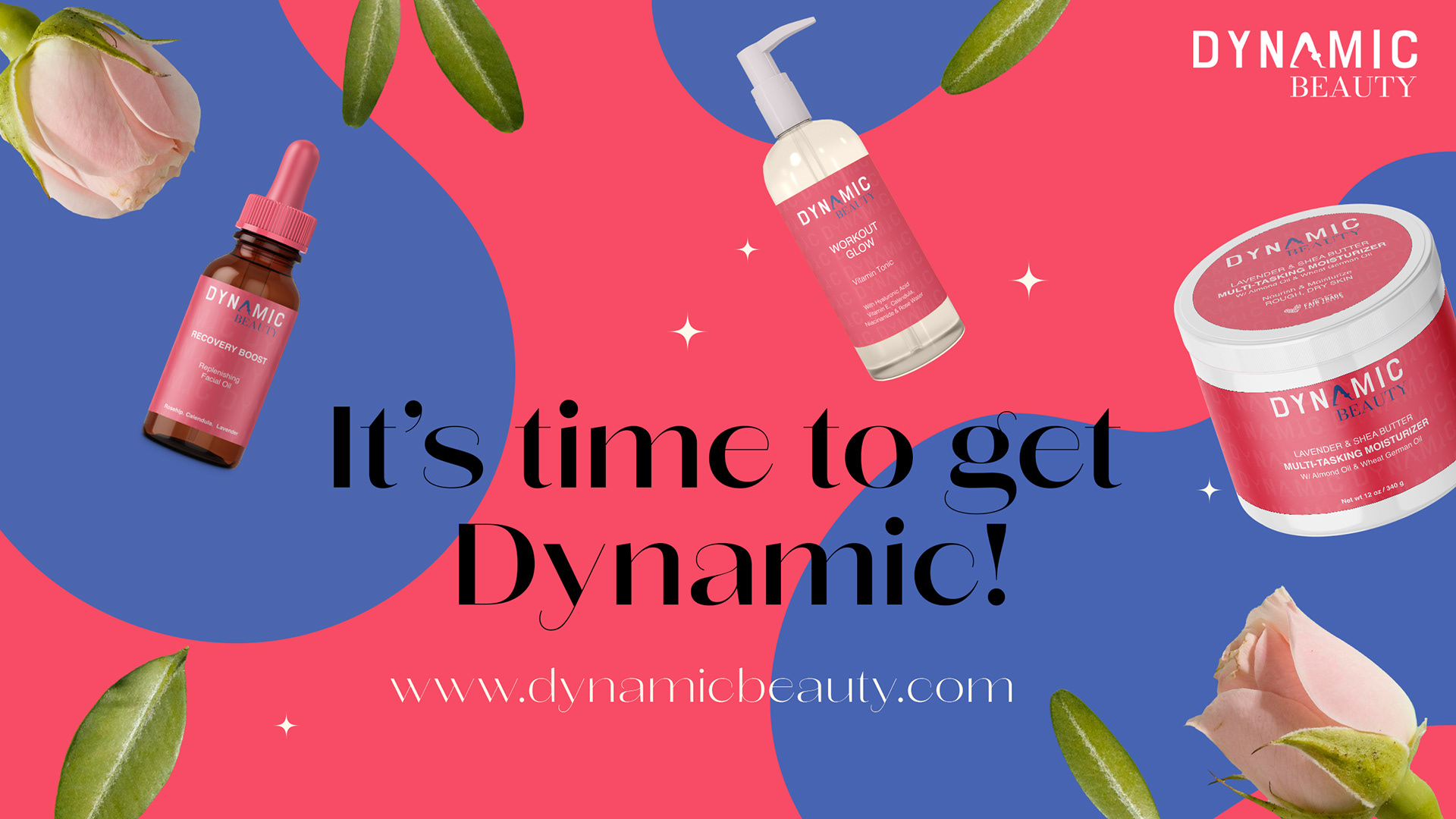
Dynamic Beauty Ad
The advertisement I crafted showcases all three products with their vibrant wrap-around labels in a playful composition. A clever call to action, "It's time to get dynamic," prompts consumers to visit the website for purchasing. Brand colors and the logo are consistently used throughout, maintaining visual coherence and reinforcing brand identity.